Reimagining a
Digital Solution for Grief
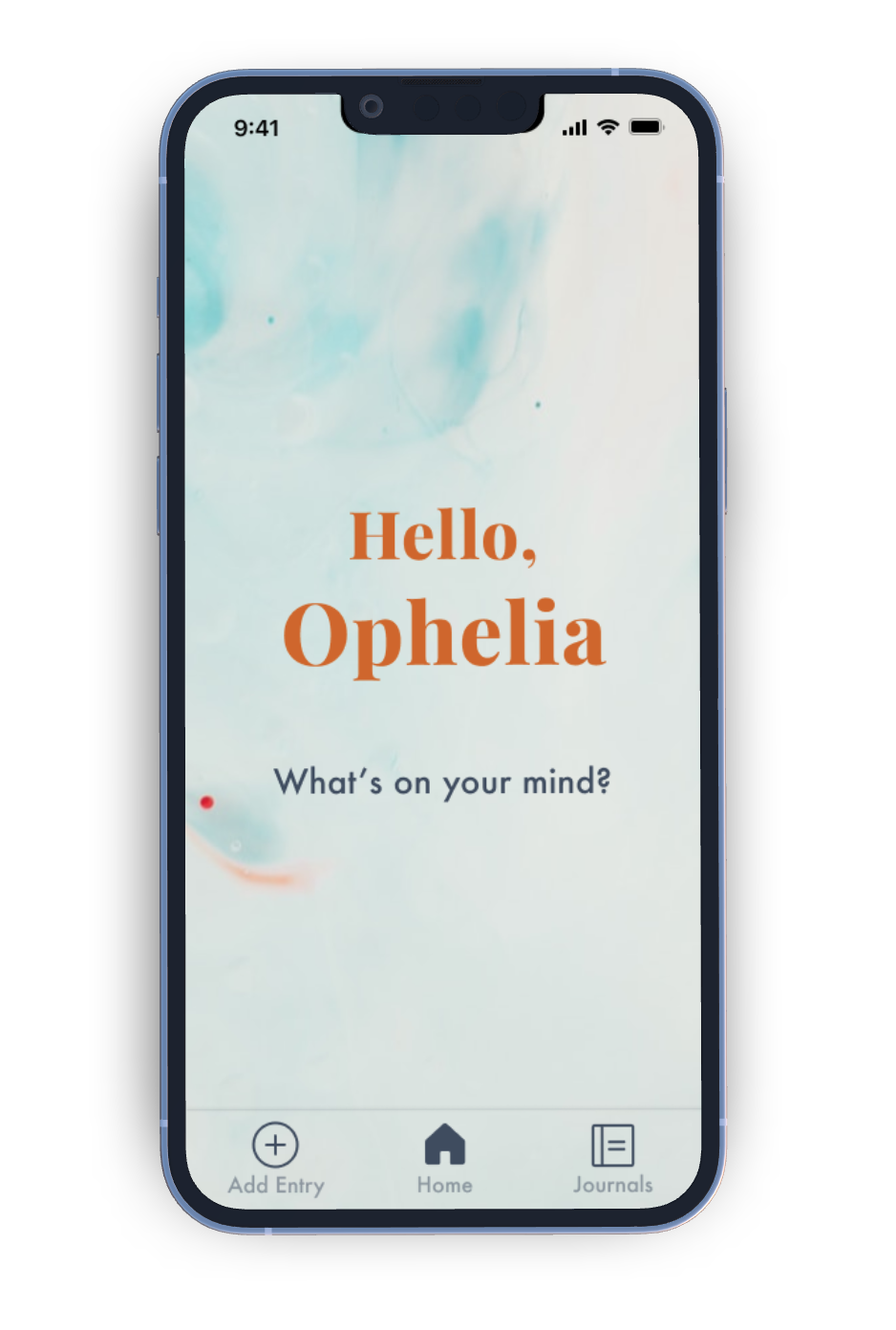
How are you?
No, how are you really?
Grief is a universal emotion, but its complexities remain elusive. Despite numerous digital mental health products, none concentrate on grief.
OVERVIEW
In the digital wellness space, I noticed a significant gap in support systems, especially in addressing the profound and sensitive issue of grief. Many existing wellness products and services appear to overlook this crucial aspect of mental health.
Recognizing this gap, I undertook a design journey to craft a mental health tool tailored to meet the unique needs of individuals who are grappling with the complexities of grief.
Project
Academic
Apr - Jul 2022
Timeline
8 weeks
Role
UX/UI Designer
Tools
Figma, UserZoom, Zeplin
Platform
Mobile iOS
watchOS
APPROACH
I merged the design thinking process with a non-linear, user-centric, iterative approach. This blend involved understanding user needs, generating innovative ideas through divergent thinking brainstorms, and rigorously testing concepts while staying highly attuned to their primary goals and pain points within the problem space.

Explorative Research
DISCOVERY
In the past year, I have lost a relative that was very dear to me. Feeling deep grief was a foreign and confusing emotion yet I was unable to find the words to express myself, which lead to feeling isolated in my grief. My journey implored me to explore this further and inspired me to deep dive into this pervasive yet complex space.
If we cannot understand the grief,
how can we support those who are struggling?
SECONDARY RESEARCH
I had a number of questions moving into this research space:
- How many people take the time to acknowledge and grieve their loss?
- What does society teach us about loss?
Through my research, I have learned that society equates grieving with death, but loss encompasses more than death. Grieving can also manifest from non-death losses (NDL) such as: moving, personal injury, sickness, financial loss, infertility, and a plethora of other examples.
How might we develop a digital space for grievers in order to support them in navigating the complexities surrounding loss?
Primary Research
Armed with a set of carefully crafted questions, I conducted qualitative and quantitative interviews with four millennials (aged 30-40) to understand their experiences with grief and their engagement with digital wellness products. This demographic was selected due to its likelihood of varied life experiences, including non-death losses. These interviews aimed to uncover insights into their behaviours, challenges, and aspirations.
Using affinity mapping, I analyzed the data and identified a compelling finding that guides the development of a user-centric solution for grief support in our problem space.
KEY INSIGHT + THEMES
Users feel isolated in their grieving process due to a lack of resources available to learn about their loss, thus prolonging their mourning

Who is our User?
Imagine I had a treasure chest filled with the insights and experiences of my users. Affinity mapping helped me open that chest and gather all those valuable pieces.
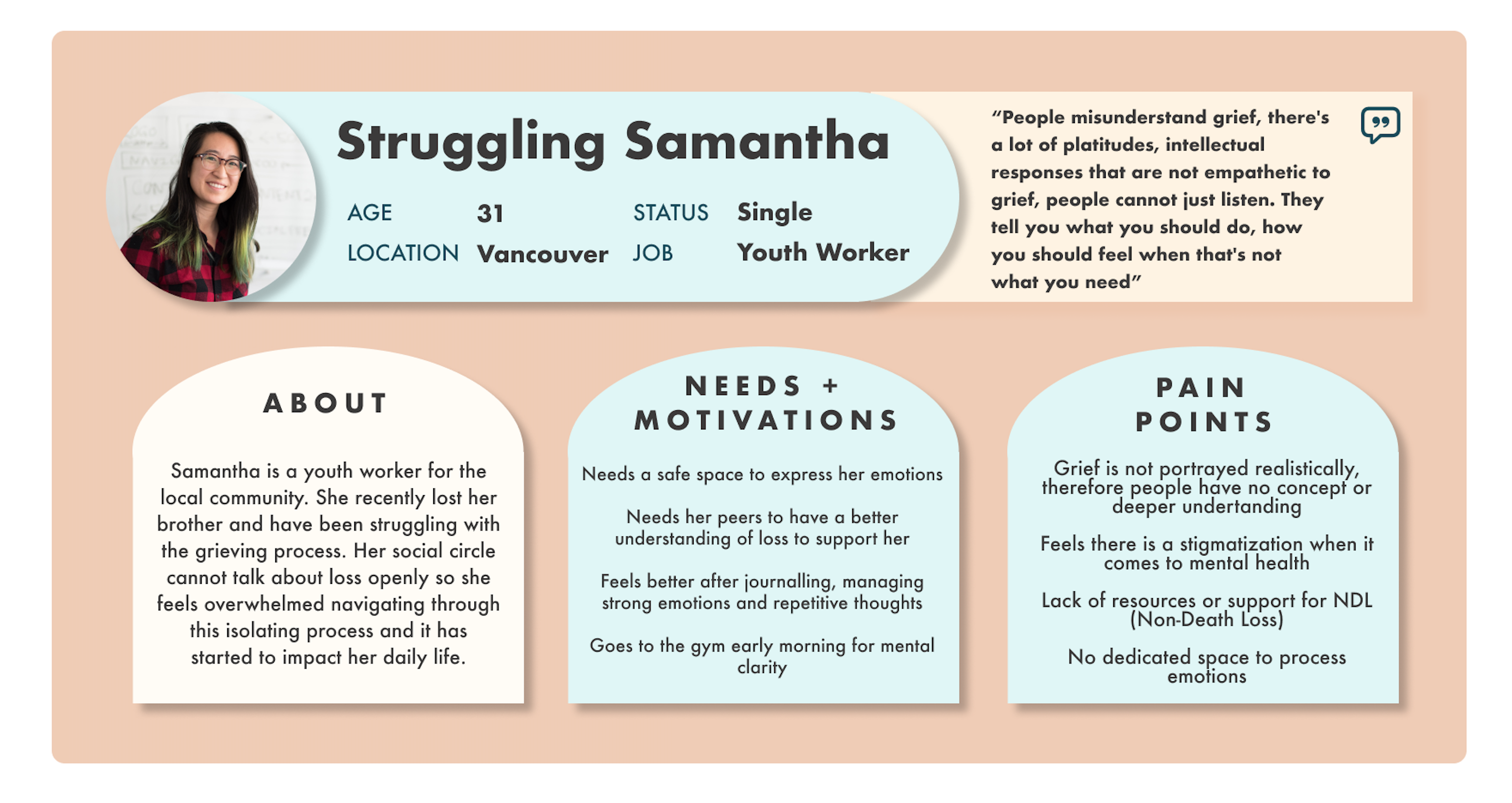
With these insights, I created a persona that represents the hopes, needs, and challenges of our users—a guiding star for our design journey.
"I feel people misunderstand my grief, I'm offered platitudes and intellectual responses that lack empathy.
People cannot just listen. They offer advice on what to do, how to feel and how long to grieve but this isn't genuinely helpful"
Where are our opportunities?
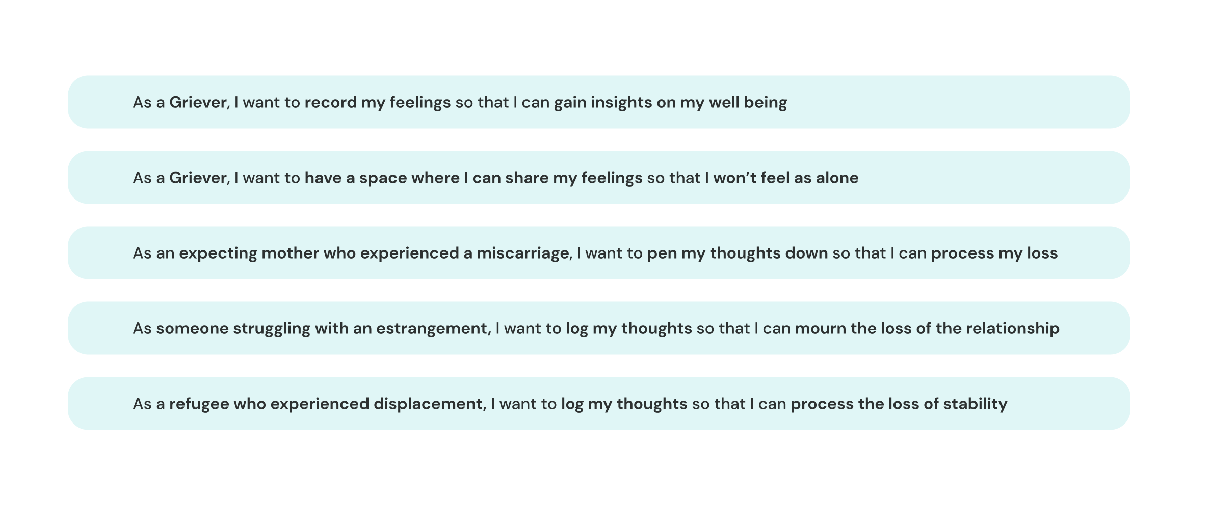
USER STORIES
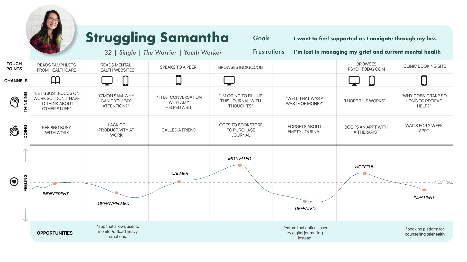
With both my persona and experience map at my disposal, I can pinpoint key opportunity points for designing a digital product tailored to my user's needs. Crafting user stories allows me to gain a deeper understanding of the diverse users who stand to benefit from my design intervention.


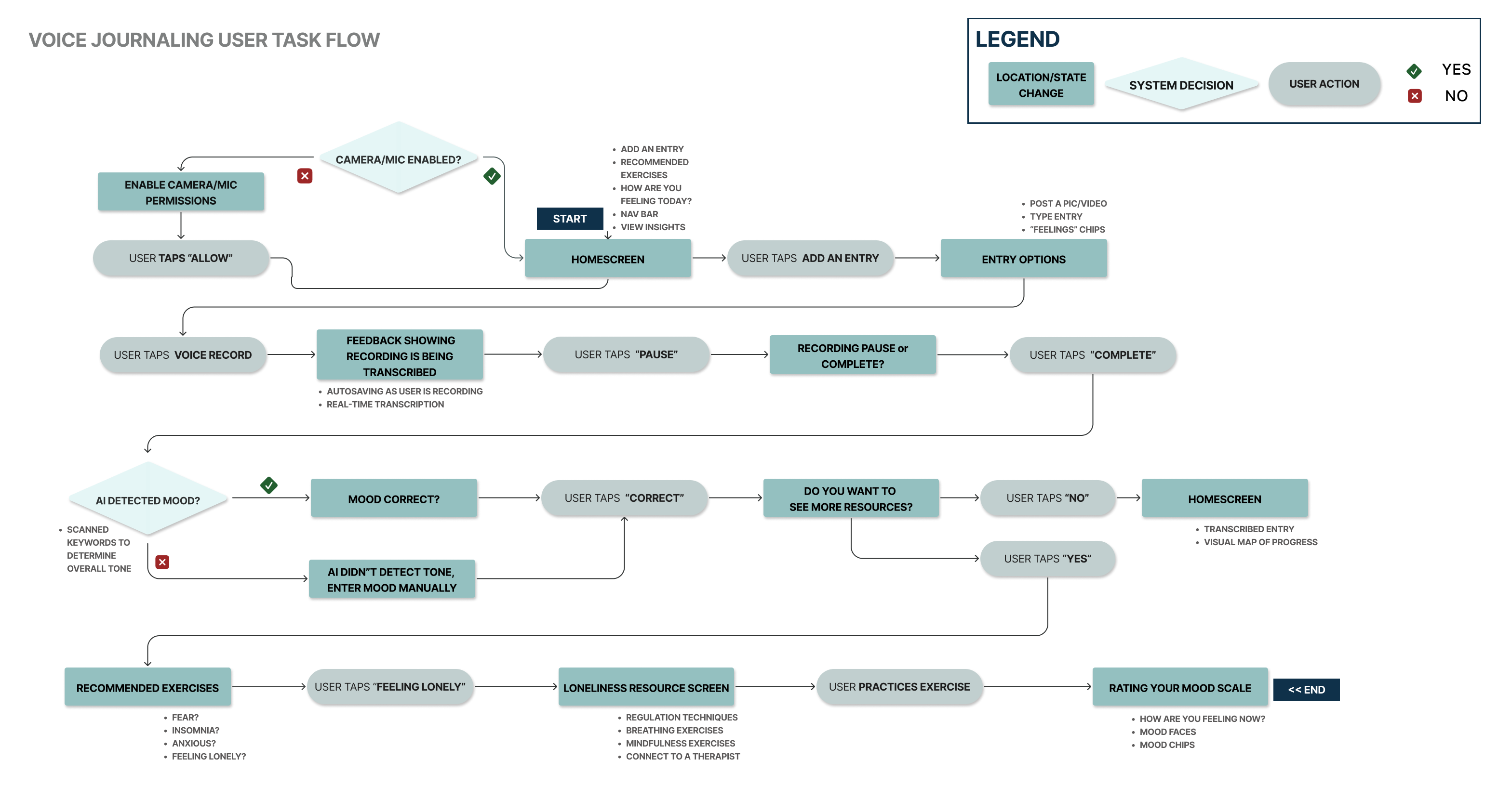
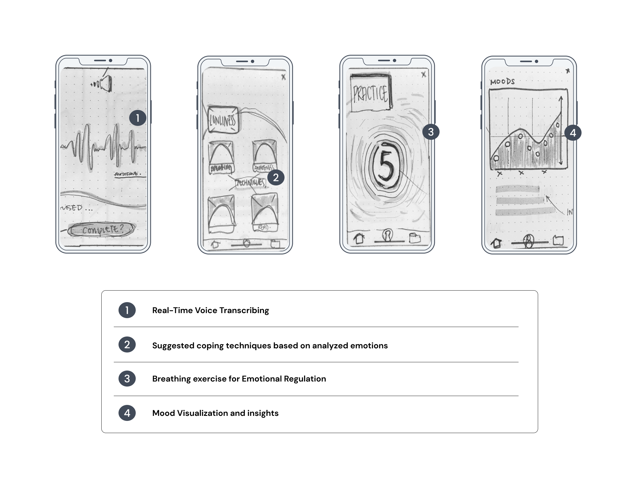
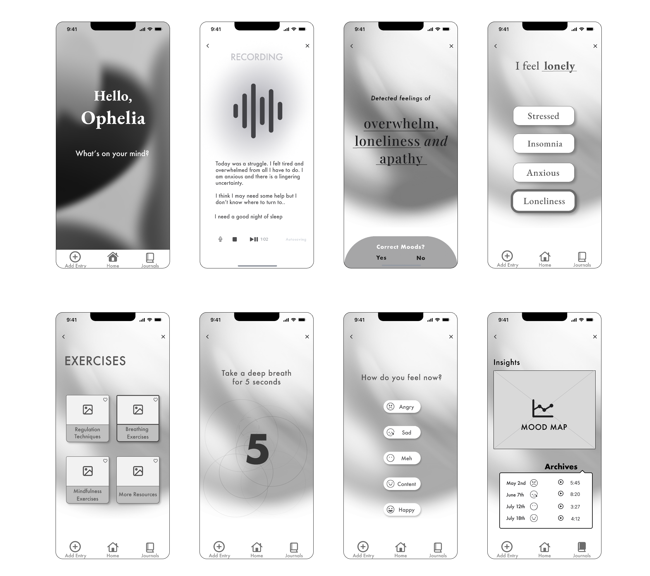
Keeping my primary user story at the forefront, I crafted a task flow centred on guiding the user through a Voice Journaling application, designed to complement their mental well-being journey. The application would transcribe user input, analyze the overall tone, and provide access to relevant resources, alongside a feature for visualizing mood progression.
Our (divergent) thinking hats on ..
LO-FI PROTOTYPE
From my solution sketches, I was able to translate my drawings and inspire me to create a basic wireframe delineating the journaling and searching for resources process. I wanted to create a simple task flow as to not overwhelm a user with limited capacity.
Putting the Design to the Test
INITIAL TESTING ROUND
I conducted 2 rounds of usability tests with 30 users to gather real-time feedback aimed at enhancing the design. This effort aims to establish a comprehensive dataset, highlighting current pain points and future enhancement opportunities for an improved user experience. Users are assessing the product's intuitiveness, task clarity, and their confidence in task completion during these tests.
Design Evolution: Iterate, iterate, iterate
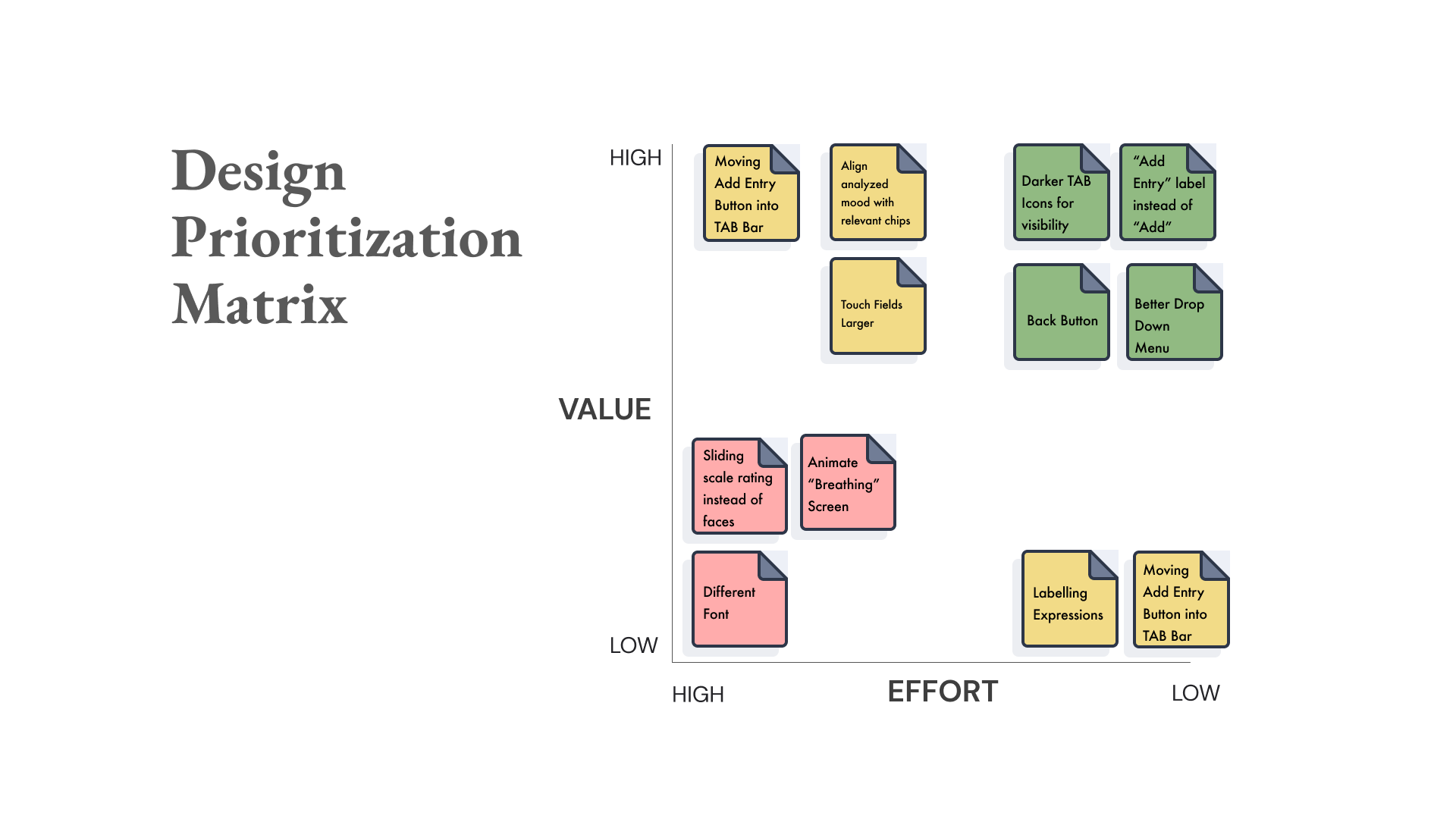
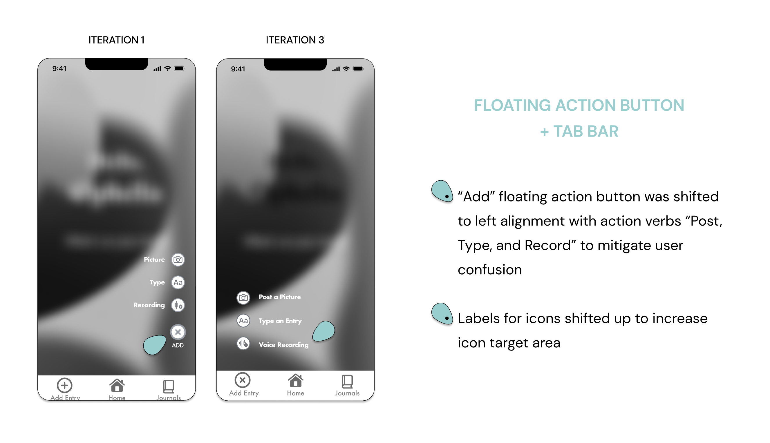
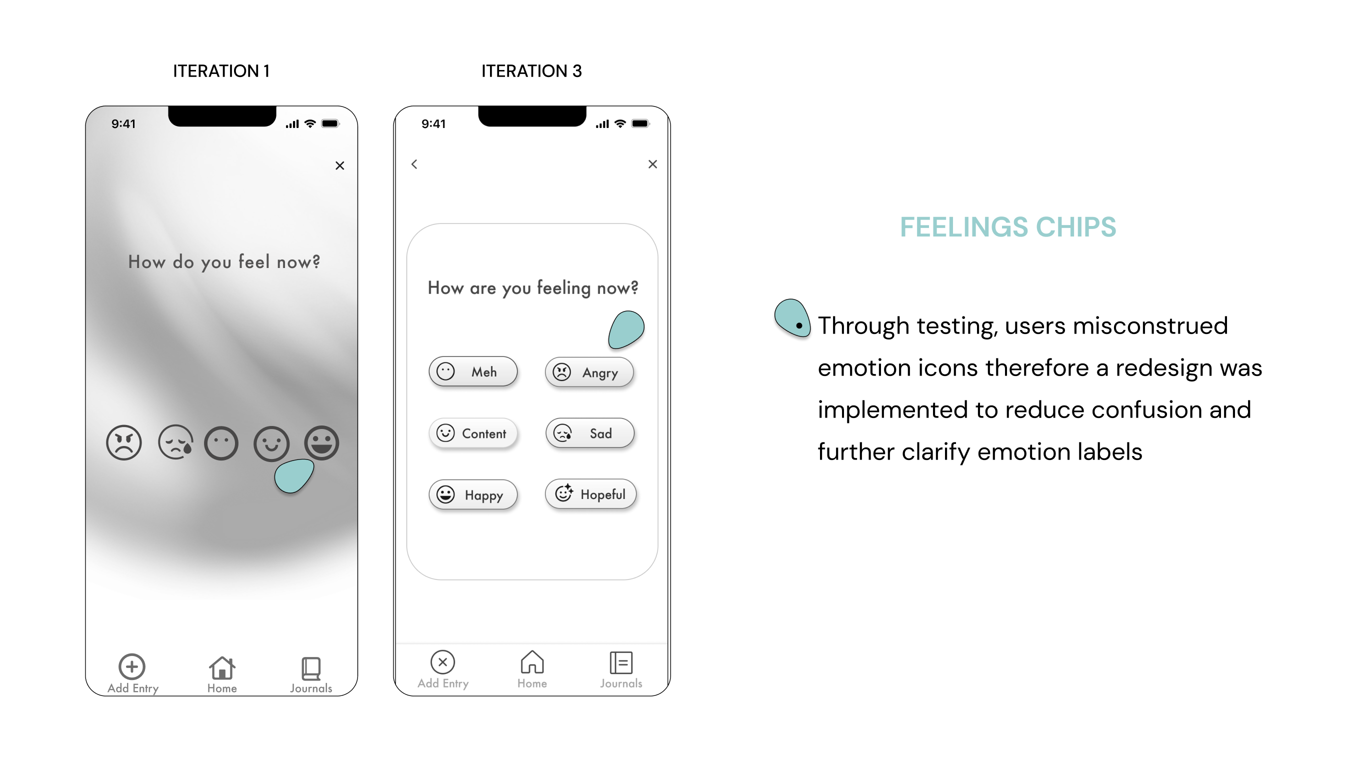
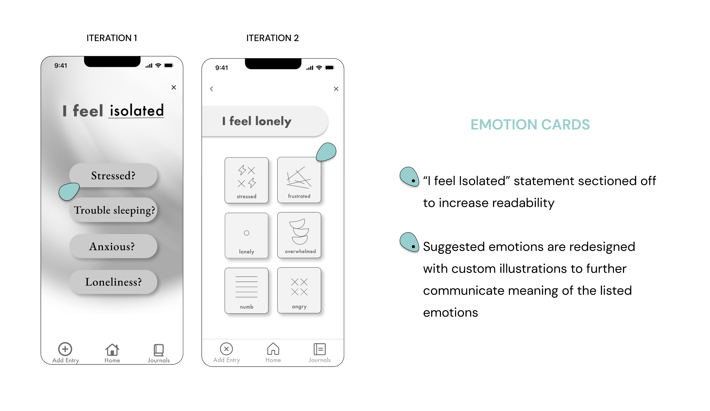
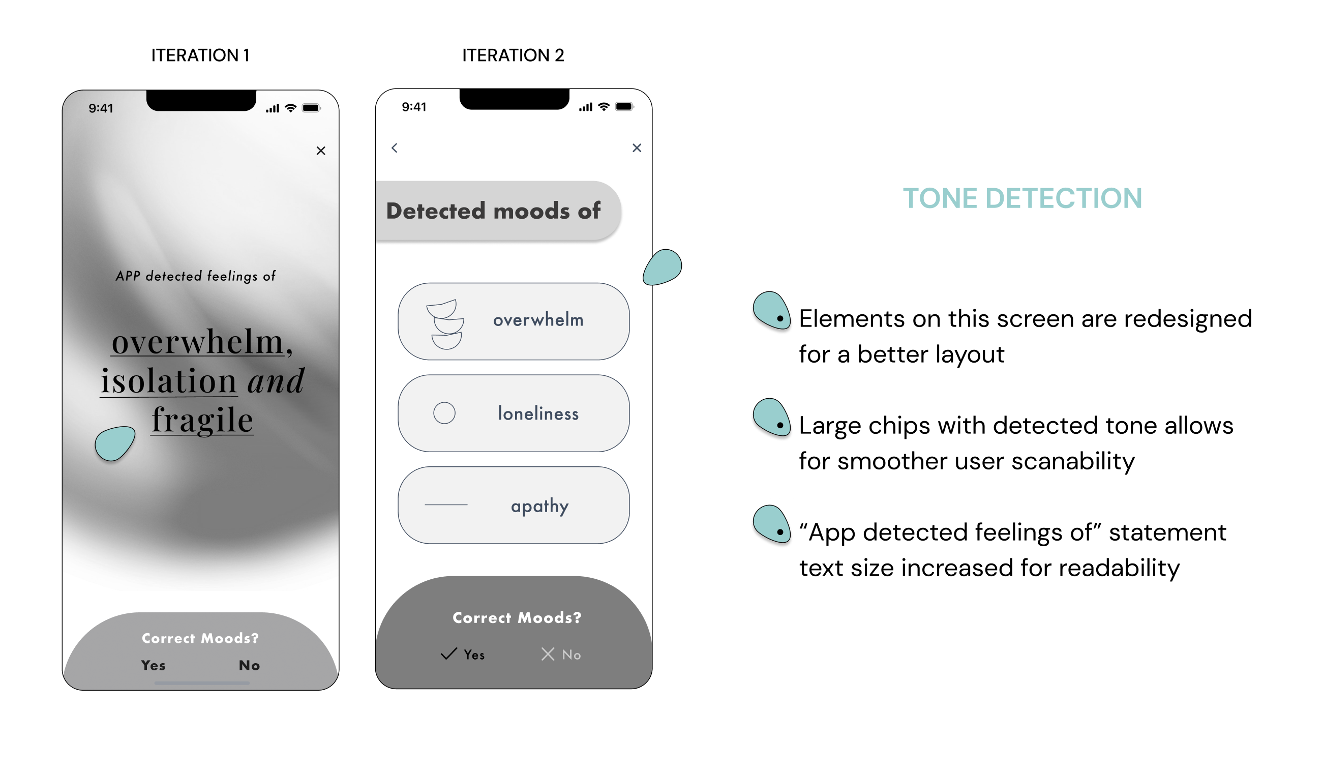
User feedback from testing informed our iterative design process, addressing usability gaps that had been initially overlooked in the prototype.
We proceeded to make revisions and conducted a second round of user testing to validate the changes
Here's a concise summary of the most significant design improvements we implemented
Triumph in Round 2
Achieving 100% User Success
After analyzing initial user feedback, we made targeted revisions guided by UX success metrics. In the second round of testing, success was measured through task completion rates and task efficiency which achieved a remarkable 100% success rate, confirming the effectiveness of our improvements. This quantitative success validated the effectiveness of the improvements in closing usability gaps
Users' enthusiastic feedback reinforced the alignment of the application with their needs, serving as qualitative evidence of our design's success.
Design Epiphanies
Discovering User Wisdom
Focusing on the fundamental needs of our users is paramount, this became evident learning grievers often lack the mental capacity to engage with extensive text; instead, they seek a simple platform for expressing their thoughts.
This insight steered me into designing an intervention that reduces interaction costs and mental load
Users may not always have a distinct mood to immediately rate. By solely offering predefined emotion states, some users may feel constrained.
To address this, I recognized the importance of incorporating a sliding scale feature as this provides a spectrum of options, allowing users the flexibilitythey may appreciate when rating their moods
SOLUTION
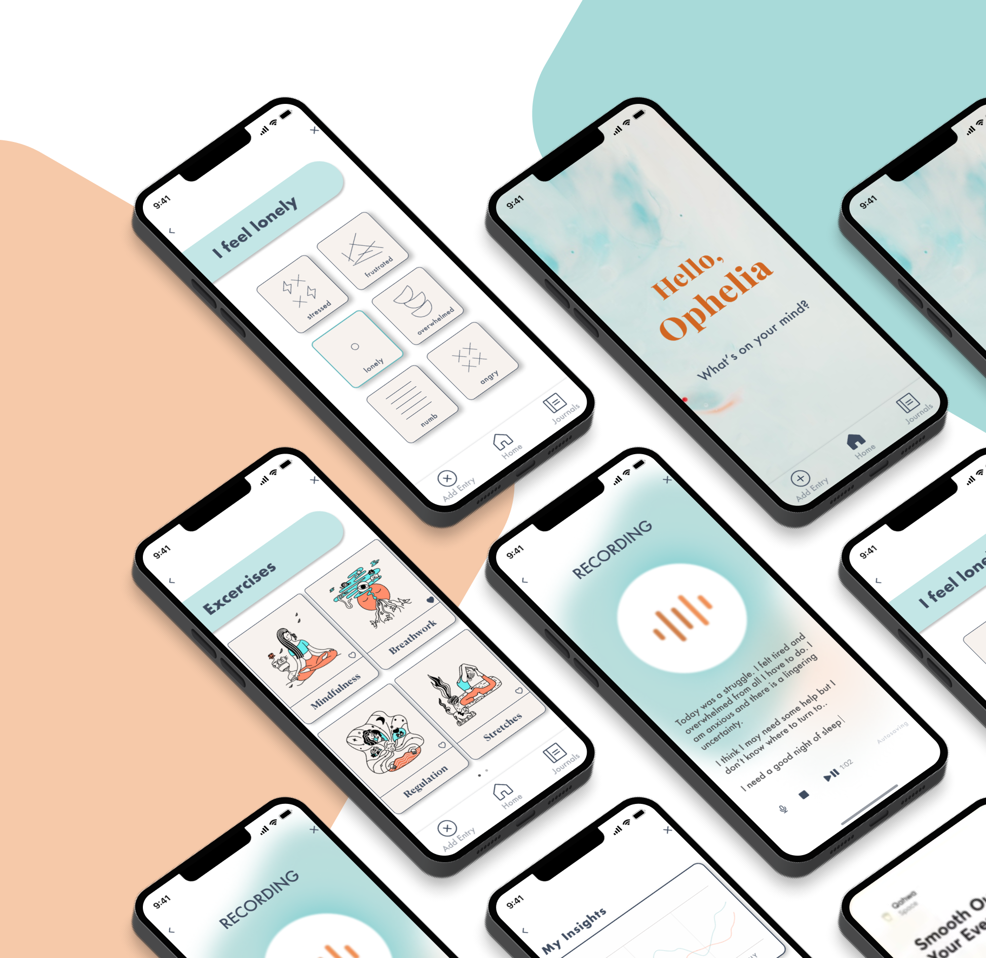
"fine." is a user-centric mental health resource that employs voice journaling to facilitate emotional processing during trauma, especially grief. Prioritizing user-friendliness, it simplifies emotion tracking through intuitive data recording and visualization, enhancing self-awareness and mental well-being
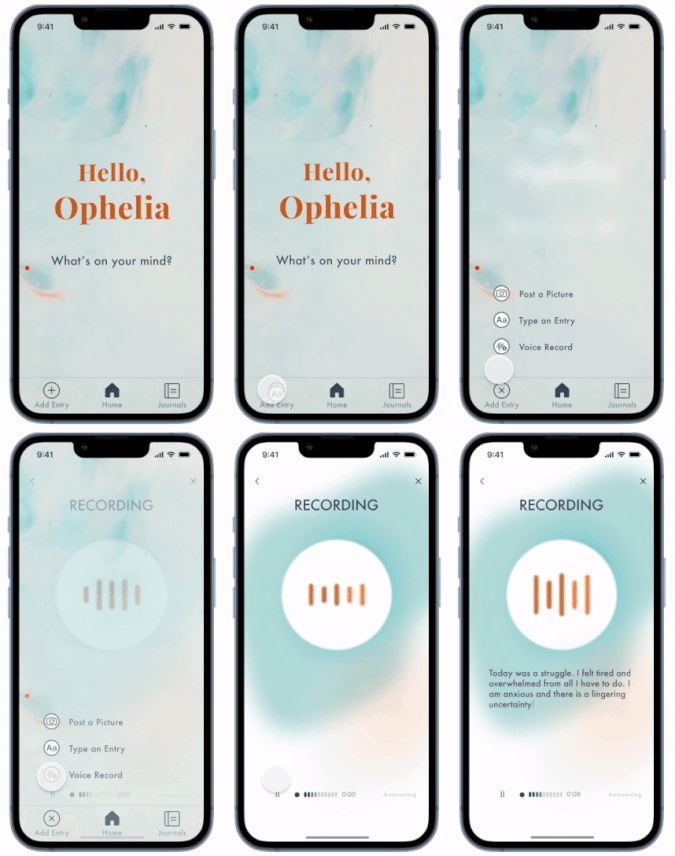
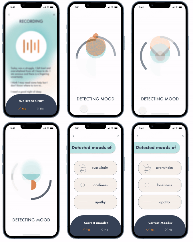
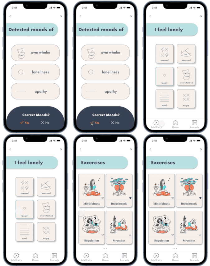
User records their voice journal entry and fine. transcribes in real-time. The entry is then processed via keywording technology and detects the tone from the user's input.
The user chooses voice journaling but has the option to choose other forms of input if the user's environment is not suitable for voice recording.
Once the user confirms the detected moods as correct, fine. will suggest mental health exercises for a user to practice for emotional regulation
Delivering Empathy in Hi-Fidelity
Through what seemed like endless iterations and copious revised design decisions, focusing on usability as the main target, I am proud to present my final hi-fidelity prototype
fine. helps you find your words when it feels like there are none that can express how you feel.
Empowering Resilience
Future Steps in Mental Wellness
My next step would be exploring opportunities in health tech for my design intervention. With the current state of the world, mental health should be a priority for all of us. My design provides value in today's fast-paced time-constrained world that does not allow the space for introspection and reflection, based on the aforementioned traits, I believe my product fits aptly in the wellness space.
Through this project, I have gained valuable learnings that I can apply to future use cases
1
Focusing on the fundamental needs of our users is paramount, this became evident learning grievers often lack the mental capacity to engage with extensive text; instead, they seek a simple platform for expressing their thoughts.
This insight steered me into designing an intervention that reduces interaction costs and mental load
2
Users may not always have a distinct mood to immediately rate. By solely offering predefined emotion states, some users may feel constrained.
To address this, I recognized the importance of incorporating a sliding scale feature as this provides a spectrum of options, allowing users the flexibility they may appreciate when rating their moods
Recent Projects

